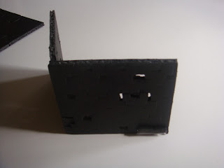
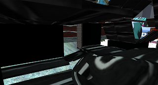
I have received my laser cut pieces and sprayed my mdf. I have decide to alternate wood and perspex as it creates a nice contrast in texture in order for the shapes of the jigsaw pieces to stand out.
I have made the concrete mold and I have begun to pour the concrete in earlier in case anything comes up.
Tuesday, 27 September 2011
Monday, 26 September 2011
Development 2
Over the weekend I tried many different models and alternatives of how the puzzle pieces could sit together in order to create light as well as sit together. I also produced a small 1:5 model of what potentially my 1:1 section could be made from.
I drew a 1:100 scale plan and section in order to see how the public can move through the spaces.
When I think of puzzle pieces I think of wood and plastic so I wanted to use one or the other. After todays discussion, I am now taking out the clay organic shapes and just leaving it with a pathway. And I have decided to use both acrylic and wood for the puzzle pieces in which I will make four shapes for the puzzle pieces that tessalate. The two materials will give a nice contrast since if I only used acrylic even with the puzzle pieces it would still be one skin. I have overlapped pieces and re-orientated them in order to allow more light in.
I have decided where I want to model my 1:1 section. I wanted to model the entrance and its relationship to the ground so that it could be seen that the building leads up from the steps as if the building is welcoming the public. So i will need to make a concrete mold for the foundation and I will get my puzzle pieces laser cut to ensure that they are precise when fitting together.
Thursday, 22 September 2011
Development 1
For Thursday we had to produce another augmented drawing at the least as well as beginning to experiment with making models.
So I decided to use some foamboard and experiment with the facade of how I could allow more light in. The facade almost looks like jigsaw pieces so i tried cutting pieces and overlapping pieces in order to see how it would allow light in. Within the beginning hallway I also added a path in which the public could walk through instead of just walking past on the stairway.
However I found it difficult to draw this into a new augmented drawing as from the front view, it looks the same.
I need to think about different ways in which light could enter as well as different ways of placing the puzzle pieces. Also since there are two paths, 1 for the public and 2 for the colleagues I need to find a way in which people know that one certain path is for the public.
Wednesday, 21 September 2011
Drawings
I produced my two augmented drawings for the Wednesday. Out of the two though, the Secondlife builidng conveyed more information as some of it was lost in the augmented drawing. For the sketched augmented drawing I tried out two different types of paper to draw on. One i used black paper and a white pencil since the idea surrounding my building was about starting from darkness and allowing light to enter. And the other I used tracing paper for the idea of penetration of light but I decided to use the one with the black paper as the one to show. For my three materials I thought of using clay as the flooring as the transition spaces between the colleagues' work spaces were fluid and organic. I wasn't sure about the development therefore I chose glass as a way to let more light in as well as aluminium but all three materials were very light in colour and after the discussion, it was clear that glass was not needed in order to allow more light to enter the builidng and that there are many other various ways of allowing light in.
My gifting idea is that the building in itself is a gift to the public. Since it is situated in the middle of a public walkway, I decided that allowing the public to experience the space of the colleagues building would be a gift to the public.
My gifting link I put on the digital carnival page - This is the Massimiliano Fukas Congress Centre in Italy. http://www.arcspace.com/architects/Fuksas/congress_index.html. It is an incredible piece of architecture that can be shared with the public as well as the capability to hold a lot of people. I thought that this link went with my concept of gifting where the building is a gift to the public and is welcoming.
Monday, 19 September 2011
Augmented Reality - Workshop 4
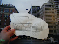
For the next two weeks I have the last workshop out of the four. This weeks workshop called augmented reality has the main task of constructing the 1:1 section (construction detail). This weeks idea is gifting and we have to come up with a link of something to do with gifting and share it on the Digital Carnival Facebook page. We looked at the artist Ben Heine who creates sketches in context of a place and is then photographed in the same place. The two images below are some of Ben Heine's work.
Augmented drawings are a quick way of sketching ideas in which we want to convey without having to construct it and there can be many variations made which can be worked on quickly or taken time. For the Wednesday we have to produce two augmented drawings. One will be our Secondlife building photoshoped in and the other will be an augmented drawing. As well as the two drawings we must come up with an idea of gifting as well as bring 3 materials that our building could potentially be made out of. This week we are developing the building that we have created in the previous workshop.
Augmented drawings are a quick way of sketching ideas in which we want to convey without having to construct it and there can be many variations made which can be worked on quickly or taken time. For the Wednesday we have to produce two augmented drawings. One will be our Secondlife building photoshoped in and the other will be an augmented drawing. As well as the two drawings we must come up with an idea of gifting as well as bring 3 materials that our building could potentially be made out of. This week we are developing the building that we have created in the previous workshop.
Saturday, 17 September 2011
Peer Review 3
This week I once again reviewed Group 3 however this time it was augmented reality creating the 1:1 section of the construction detail.
The first two augmented drawings they had to do from this group - one was using their precedent building and ideas surrounding materials used and for the second one they had to get in groups in which they chose the two weakest designs from the previous weeks and work with those.
Nicole Daw - http://nicolearchdes.blogspot.com/
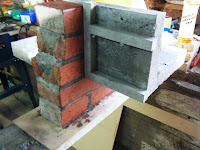
Nicole created a building which was made of simple rectangular modules. One made from concrete and the other made from glass perpendicular to the other rectangle and looked on out to the road. The building sat right in between two others, suspended. What I liked about this construction detail was that Nicole chose a section in which showed the relationship between her building and the existing builidng next to it. Also, instead of just using a concrete grid on the facade of the building, she also tried a steel one so she was exploring different ways of interpreting her builidng.
Regan Tse - http://archdes101rt.tumblr.com/
Regan created quite an open and shared space for the five colleagues at work. It was made form perspex mainly in which the perspex squares were stacked on top of each other to create a grid pattern but areas were left open so that the space felt quite shared and opened.
Sally Hosking - http://shos033.blogspot.com/
Sally used cultural traditions as her starting point for her building as well as the precedent building and the weakest building which everyone was required to start with in terms of the augmented drawing. The building consisted of a concrete circular facade in which encompassed a space which contrast with the outer walls. The inside was made from bamboo sticks in which the circular form allowed each colleague to have their own private space while also having a central area for meetings. The spacing of the bamboo was thought through so that the bamboo was placed in order for each colleague to have enough privacy at the same time not sacrificing communication with those around. I liked the idea that she focused on the spaces inside so that although it was a concrete facade on the outside, the space within was very different.
The first two augmented drawings they had to do from this group - one was using their precedent building and ideas surrounding materials used and for the second one they had to get in groups in which they chose the two weakest designs from the previous weeks and work with those.
Nicole Daw - http://nicolearchdes.blogspot.com/
Nicole created a building which was made of simple rectangular modules. One made from concrete and the other made from glass perpendicular to the other rectangle and looked on out to the road. The building sat right in between two others, suspended. What I liked about this construction detail was that Nicole chose a section in which showed the relationship between her building and the existing builidng next to it. Also, instead of just using a concrete grid on the facade of the building, she also tried a steel one so she was exploring different ways of interpreting her builidng.


Regan Tse - http://archdes101rt.tumblr.com/
Regan created quite an open and shared space for the five colleagues at work. It was made form perspex mainly in which the perspex squares were stacked on top of each other to create a grid pattern but areas were left open so that the space felt quite shared and opened.
Sally Hosking - http://shos033.blogspot.com/
Sally used cultural traditions as her starting point for her building as well as the precedent building and the weakest building which everyone was required to start with in terms of the augmented drawing. The building consisted of a concrete circular facade in which encompassed a space which contrast with the outer walls. The inside was made from bamboo sticks in which the circular form allowed each colleague to have their own private space while also having a central area for meetings. The spacing of the bamboo was thought through so that the bamboo was placed in order for each colleague to have enough privacy at the same time not sacrificing communication with those around. I liked the idea that she focused on the spaces inside so that although it was a concrete facade on the outside, the space within was very different.
Wednesday, 14 September 2011
Final Building
The one colleague- the draftsman who wanted both a front door and a back door didn't want a typical big door which is opened and shut manually therefore the use of the panels allow insight into the building and runs with the idea of allowing natural light into the building. The doors are reactive and open up when collided with.
By creating a reactive entrance which moves down to allow avatars in is a sense of welcoming where it is moving towards the avatar to welcome it in instead of waiting for an avatar to come to the entrance itself.
My threshold spaces are the ones between the spaces throughout the building. The thresholds morphs the spaces together through the use of sculpties however I had a few complications when using sculpties as flooring as it created a box which restricted avatars from walking directly over it but when I made it into a phantom, the avatars fell through therefore my solution for it was to place a prim directly under it which could not be seen but could act as the platform under the sculpties for the avatars to walk over and this worked.
I have covered the spaces less as the building progresses further in from the entrance according to the preferences and the needs for each person therefore by the time we arrive at the sculptors space the space is very much open opposite to the spaces of the draftsman and the engineer.
Matrix Elektra House - David Adjaye UK
I wanted to take the ideas of being aple to manipulate light beginning from darkness but being able to let in natural light into various spaces. In the Elektra House the facades are very different. The front is blocked off from any windows whereas the back is completely glazed.
Below are images of the interior view from different spaces of the building. The slits of space where the walls and floors/ceiling panels do not meet are intentional in order to allow natural sunlight in with the idea of manipulating light. The morphing transition spaces between the colleagues working spaces are places which have no walls and allow the most light to enter the building.
These are views from the exterior. The first is from above which shows all the ceiling panels.
This shows the reactive entrance which moves down from the building to meet the avatar at ground level.
Subscribe to:
Comments (Atom)


